
Caitlin Haedrich
Visualizations Made with RawGraphs.io
As part of Professor Laura Tateosian’s Geovisualization course, we’ve been learning different tools and software packages for creating visualizations with attractive, color-blind-friendly color ramps and palettes. In a recent lab, we focused on RawGraphs.io, a simple, web-based application that will take you from CSV to attractive visualization in less than 5 minutes. Here are a few examples we made in lab.
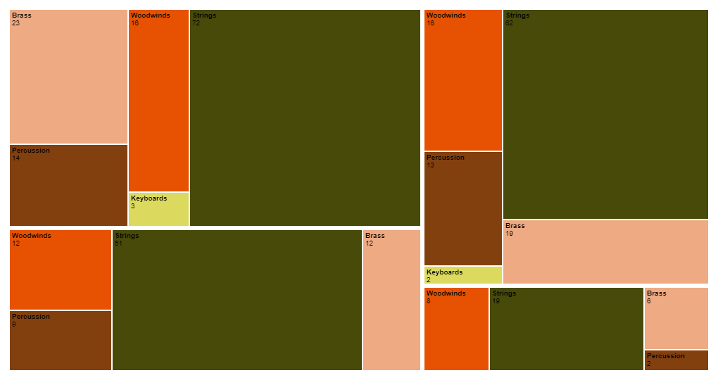
Orchestra Treemap
This treemap is from a tutorial offered by RawGraphs showing the size and composition of four different orchestras.
 Click image to see full size.
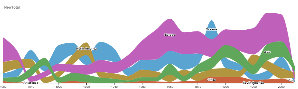
Invasive Species Bumpchart
This bumpchart shows the number of alien species first records by continent. The data can be found here but we were introduced to it by our classmate Ariel Saffer.
 Click image to see full size.
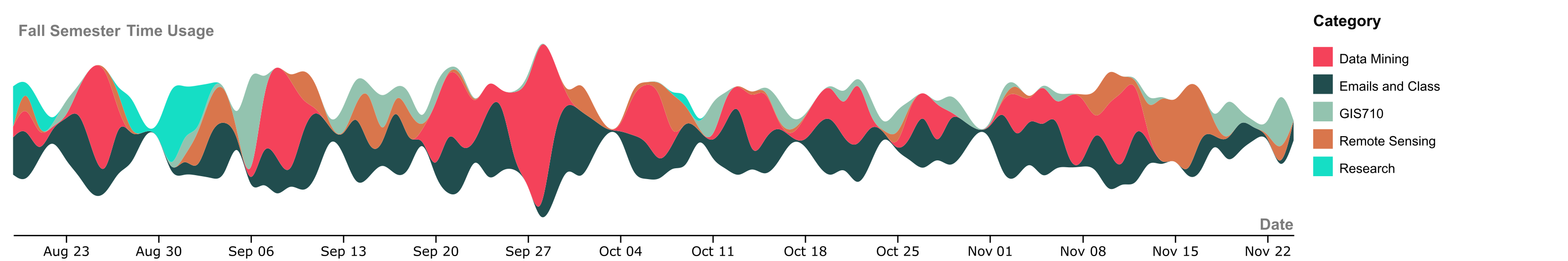
Fall Semester Time Usage Streamplot
Last semester, I kept track of how I split my time between coursework, research, email and zoom using a desktop app called Toggl. I was hoping it would help me create a sense of work-life balance in the work-from-home, zoom-athon that is our new Pandemic normal. To test RawGraphs on some of my own data, I made a streamplot showing how I split my time. The width of the lines shows how much relative time I spent on a given task per day. I left the Y-axis unlabed so you all can’t judge how long I do or don’t spend working. You can see I worked less on weekends until finals came around. In the middle of the semester, we had a Data Mining 4-day Data Challenge that took up a lot of time. You can also see how I started the semester with lofty research goals but by the third week, I realized I didn’t have time to do research and a full course load.
 Click image to see full size.