Caitlin Haedrich
Data Visualization with QGIS
As part of Professor Laura Tateosian’s Geovisualization course, I’ve been learning about some advanced visualization feature in QGIS. I’ve included a couple examples below I created following Kurt Menke’s wonderful youtube tutorials.
Live Layer Effects
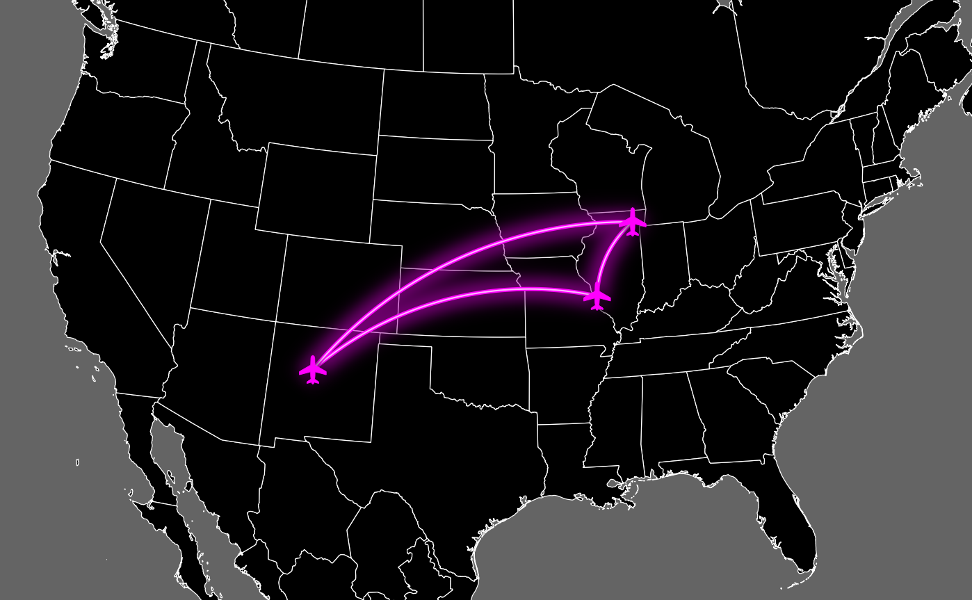
This map shows a flight path in the Midwest USA. Using the “outer glow” effect with a custom color ramp, the flight paths get a neon glow appearance which stands out nicely against the dark background. A second copy of the paths is super imposed on the glowing path and set to a thinner line width and brighter pink, adding even more pop to the paths.
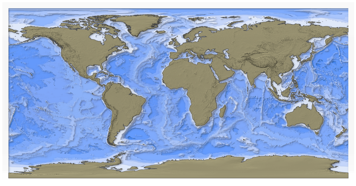
Using the inner shade draw effect, this bathemetry vector map takes on a layered or 3D appearance. For the continents, the “multiply” layer blending mode provides a hillshade texture by multiplying the continent outline with a hillshade raster.
Layer Blending: Multiply and Overlay
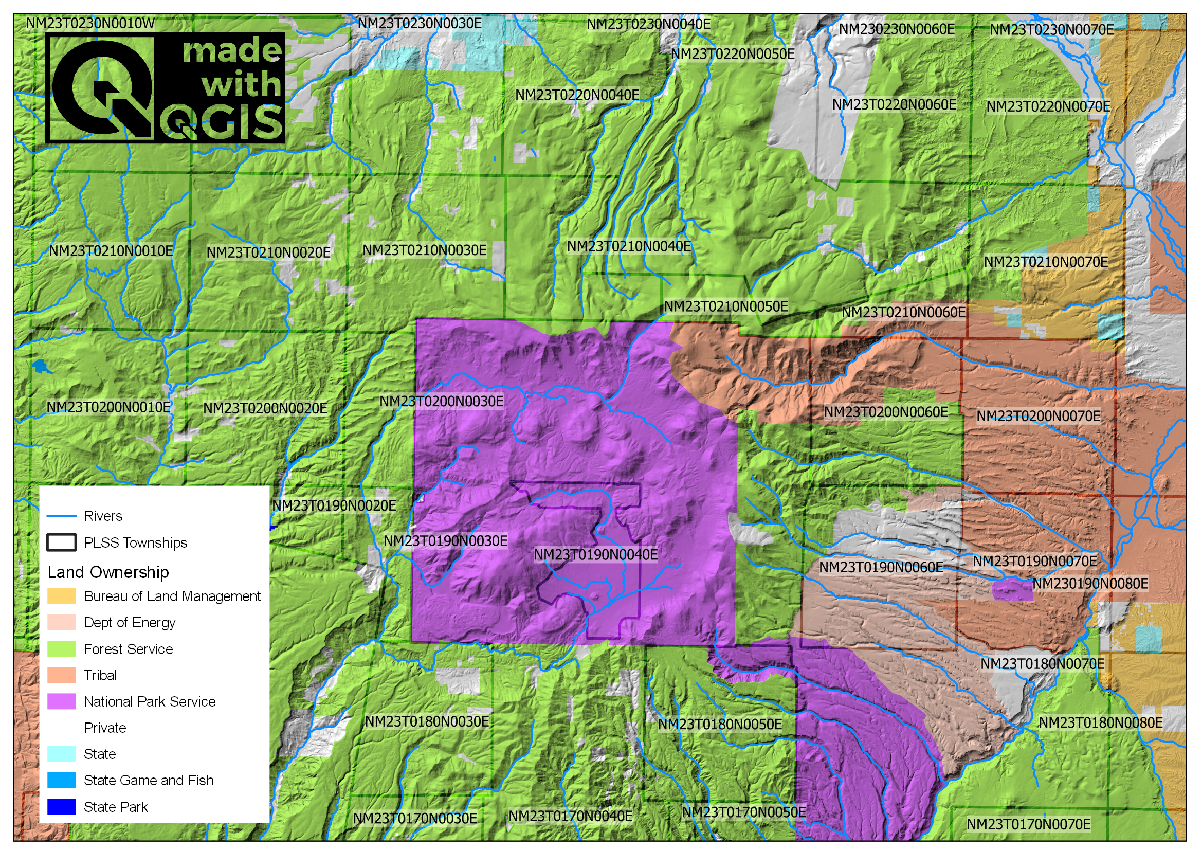
To create this map of Jemez, New Mexico, we use the “multiply” layer blending mode to add a hillshade behind the landownership layer. The township outline is blended with the hillshade with “overlay” mode.
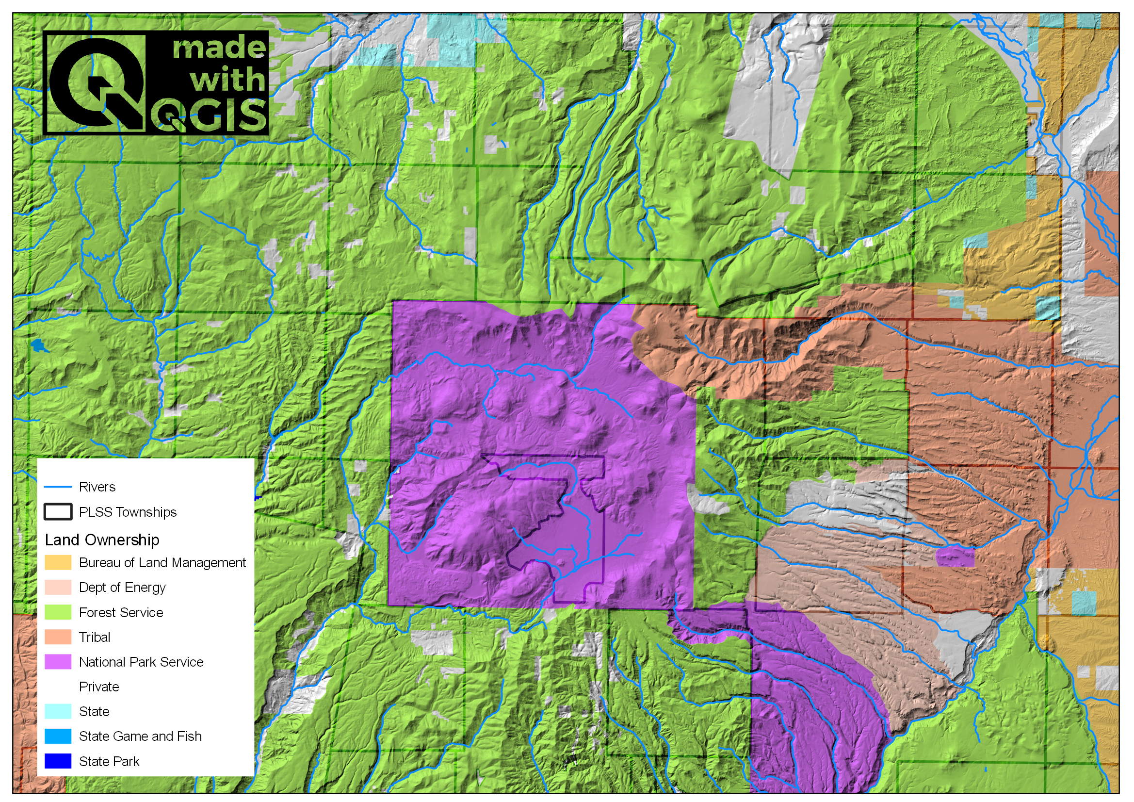
Building from the previous map, we add township names with a white background with “soft light” blending. To avoid label overlap with the QGIS icon and the legend, we use label settings > label blocking items and select the icon and legend.
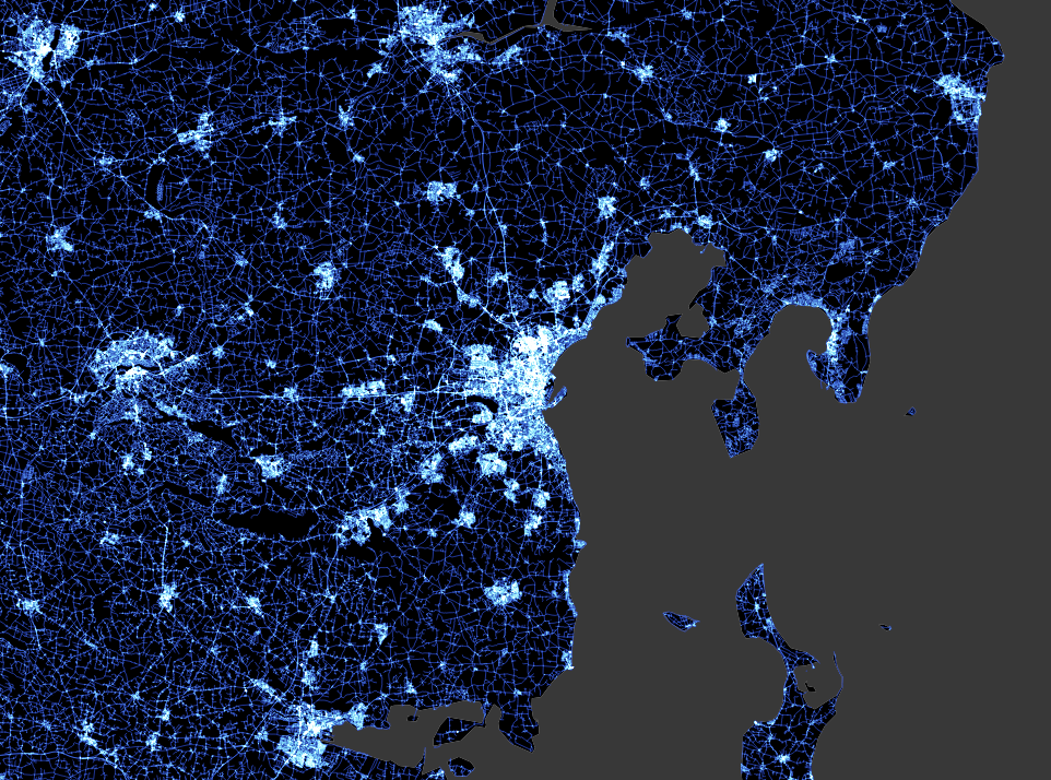
Layer Blending: Addition for Road Density
This map of OpenStreetMap roads in Denmark is made with the “addition” feature mode. If closer features are together, the brighter the color. The black base map makes the roads pop nicely and effectively shows density.
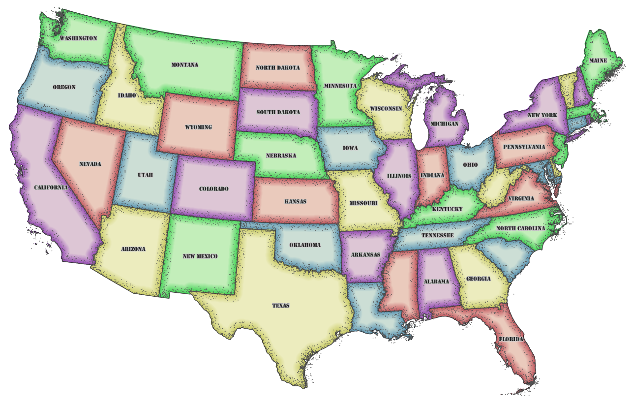
Layer Blending: Shapeburst Old-Fashioned USA Map
This map replicates an old-fashion map of the USA using the Starburst fill and a random dot boundary. The random dots are made by randomly offseting dots from the boundary line using an expression. The colors are created with the color topology module which adds a new attribute with values indicating color. The color topology module selects the minimum number of colors required to ensure no states of the same color share a border.
Applying Layer Blending Modes To My Own Maps
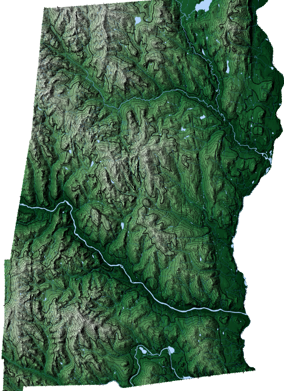
A while back, I made a map of my hometown, Norwich, VT for my dad’s office. I revisited the map to test a few blending modes. This map uses the “multiply” layer blending mode to create the hillshade with an elevation color ramp. The contours are added by duplicating the elevation layer and switching the display from “singleband pseudocolor” to “contour.”